
It’s easy to feel confident about an idea when you’re deep in a product. You know the roadmap, the goals, the personas, the strategy. You’ve thought through the edge cases. You’ve brainstormed with smart people. You’ve built wireframes, mockups, flows. Surely… you get it.
Until you put it in front of a real user – and they do something completely unexpected.
Over the years, I’ve learned to treat user behavior not as a checkpoint at the end, but as a constant reminder that I’m not the user. In this post, I want to share some personal moments where my assumptions didn’t match reality, and what those moments taught me about humility, listening, and building better products
“Obvious” Isn’t Universal
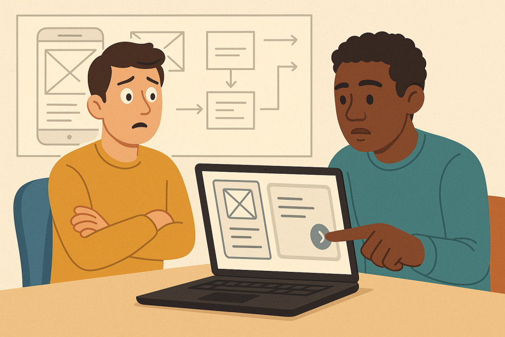
A while back, I worked on a product that had a very clean onboarding flow – or so I thought. We’d put a lot of care into it: short steps, helpful illustrations, and a clear call-to-action.
When we tested it with users, we were surprised to see hesitation. Some users hovered, clicked back, and even abandoned the flow.
Why?
Because one word – just one – was confusing. The CTA said “Start Syncing,” which made perfect sense to us internally (it triggered account setup + data connection). But to a first-time user, “syncing” sounded technical and unclear. A few even thought it would immediately pull in data they weren’t ready to share yet.
We changed it to “Get Started” and added a small explanation. Completion rates went up immediately.
Takeaway: Never assume your language is as obvious to others as it is to you. Internal vocabulary isn’t user vocabulary.
People Don’t Always Want What They Ask For
In another project, we kept hearing the same request from users: “We want more filters.” So we added them. A lot of them. Dropdowns, toggles, sliders. We thought we were giving users power.
But usage data told a different story. Almost no one used the advanced filters. Most users selected one or two simple options – or none at all. Some even got overwhelmed and bounced.
When we dug deeper in follow-up interviews, users explained they didn’t actually want more control – they wanted faster, better results. They asked for filters because they thought that was the only way to get more relevant content.
We simplified the UI, improved our default sorting, and only kept the most-used filters. It worked far better.
Takeaway: Listen to why users ask for something – not just what they ask for.
The Wrong Default Can Derail the Right Feature
In one case, we introduced a new reporting tool with a clean dashboard and customizable views. Users had been asking for this functionality for months. We shipped it, announced it, and… crickets.
At first, we assumed discoverability was the issue. But after watching a few users onboard, we realized the real problem: the default view was underwhelming. It loaded with an empty screen unless you configured it.
Most users assumed it was broken or too advanced, and gave up.
We quickly updated the default view to show a sample dataset and basic insights, even for new users. Engagement jumped.
Takeaway: Defaults shape perception. If the first experience is blank, confusing, or underwhelming, the whole feature can feel broken.
You Are Not the Target User
There was one feature I personally championed. I loved it. I used it myself in prototypes. I believed it solved a real problem. We even got a few early nods of validation in user interviews.
But when it launched… very few people used it. The ones who did often didn’t use it correctly. Some even complained that it was confusing or unnecessary.
At first, I wanted to defend it. “They’re just not using it the right way.” But the truth was simple: I was building for people like me. Tech-savvy, slightly obsessive, workflow-driven users. That wasn’t our actual user base.
We sunset the feature a few months later and focused on something simpler, more aligned with our core audience.
Takeaway: Just because it makes sense to you doesn’t mean it belongs in the product. You’re not building for yourself.
Observation > Assumption
One of my favorite “aha” moments came during a live usability session. A user landed on a form we’d tested multiple times. It was clean, mobile-friendly, and followed every best practice.
But the user paused. Then scrolled up. Then tapped outside the form. Then scrolled back.
When asked what they were doing, they said: “I’m looking for confirmation that I’m on the right step. I wasn’t sure if I should keep going.”
It turned out the issue wasn’t the form — it was the lack of visual progress indicators. A small thing, easily missed. We added a simple “Step 2 of 4” progress bar, and user confidence went up immediately.
Takeaway: Watch people use your product. Don’t just ask what they think — observe what they do.
As product managers, we love clarity. We crave certainty. But real users don’t live inside our frameworks – and our best intentions can sometimes backfire.
Every wrong assumption I’ve made has been a gift in disguise. It reminded me to:
- Ask more questions
- Test earlier
- Listen more closely
- And always be ready to be wrong
Products aren’t built in planning docs. They’re shaped by real people doing real things – often in ways we didn’t expect.
So the next time you’re convinced something is “obvious” or “perfectly clear,” do yourself (and your users) a favor: go find out.